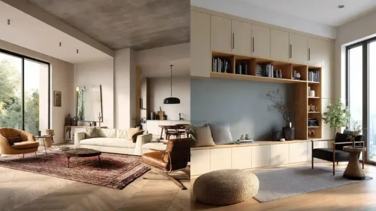
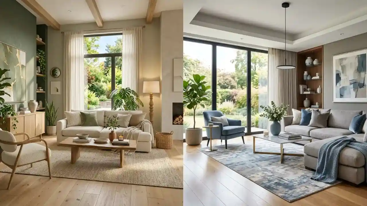
25 Summer Color Palette Ideas Designers Love in 2026
As summer 2026 approaches, interior designers are embracing color palettes that feel fresh, uplifting, and connected to nature. This year’s trends move beyond stark whites and cool grays, focusing instead on warm neutrals, earthy tones, soft coastal hues, and sun-washed colors that create inviting living spaces. The goal is to make homes feel brighter, calmer, and more comfortable while reflecting the relaxed energy of the season.
Pinterest trends show growing popularity for color combinations that blend timeless elegance with modern warmth. From sandy beiges and ocean blues to terracotta accents and muted greens, summer palettes are becoming softer, more sophisticated, and easier to live with year-round. These colors work beautifully across living rooms, bedrooms, kitchens, sunrooms, and outdoor spaces.Below are 25 Summer Color Palette Ideas by The Home Vista are loving in 2026 and how they can transform your home.
1. Warm White and Sand
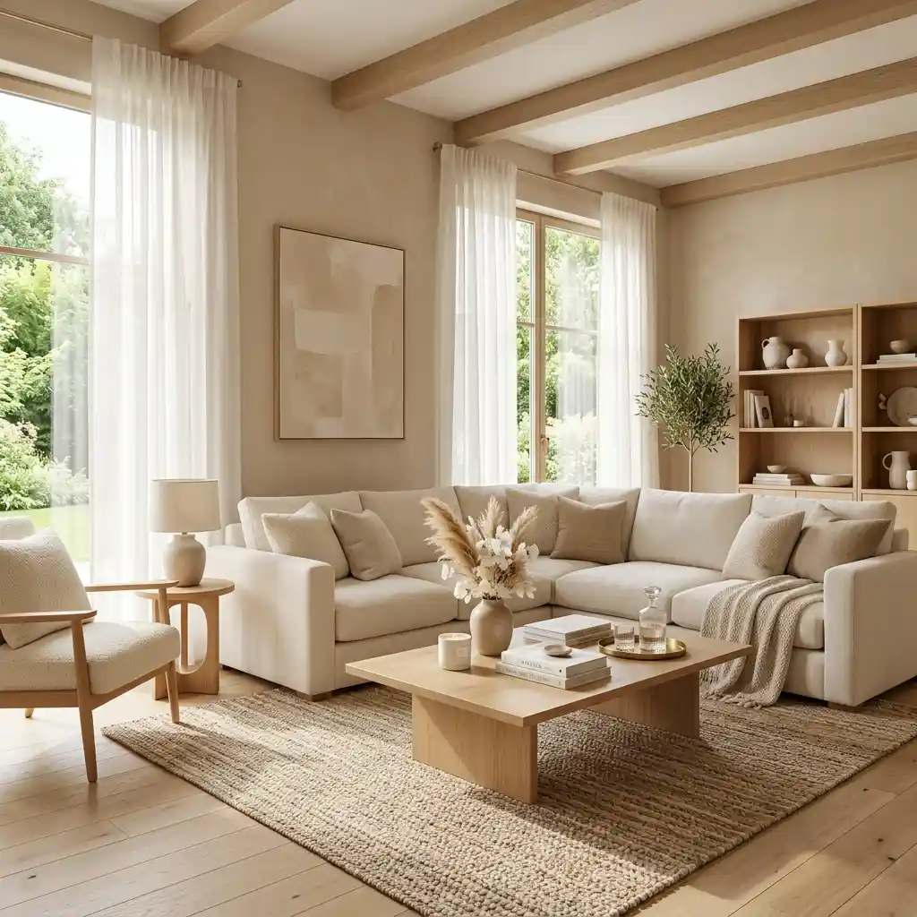
Warm white paired with soft sand tones creates a bright and airy atmosphere. The combination reflects natural sunlight beautifully throughout the day. Natural wood furniture complements the palette effortlessly. Layered textures add warmth and dimension. This creates a timeless summer-inspired interior.
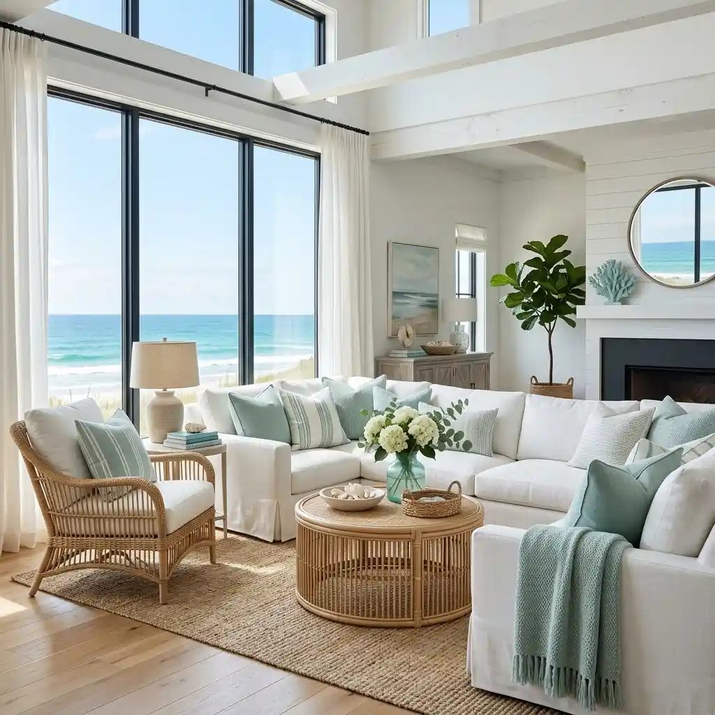
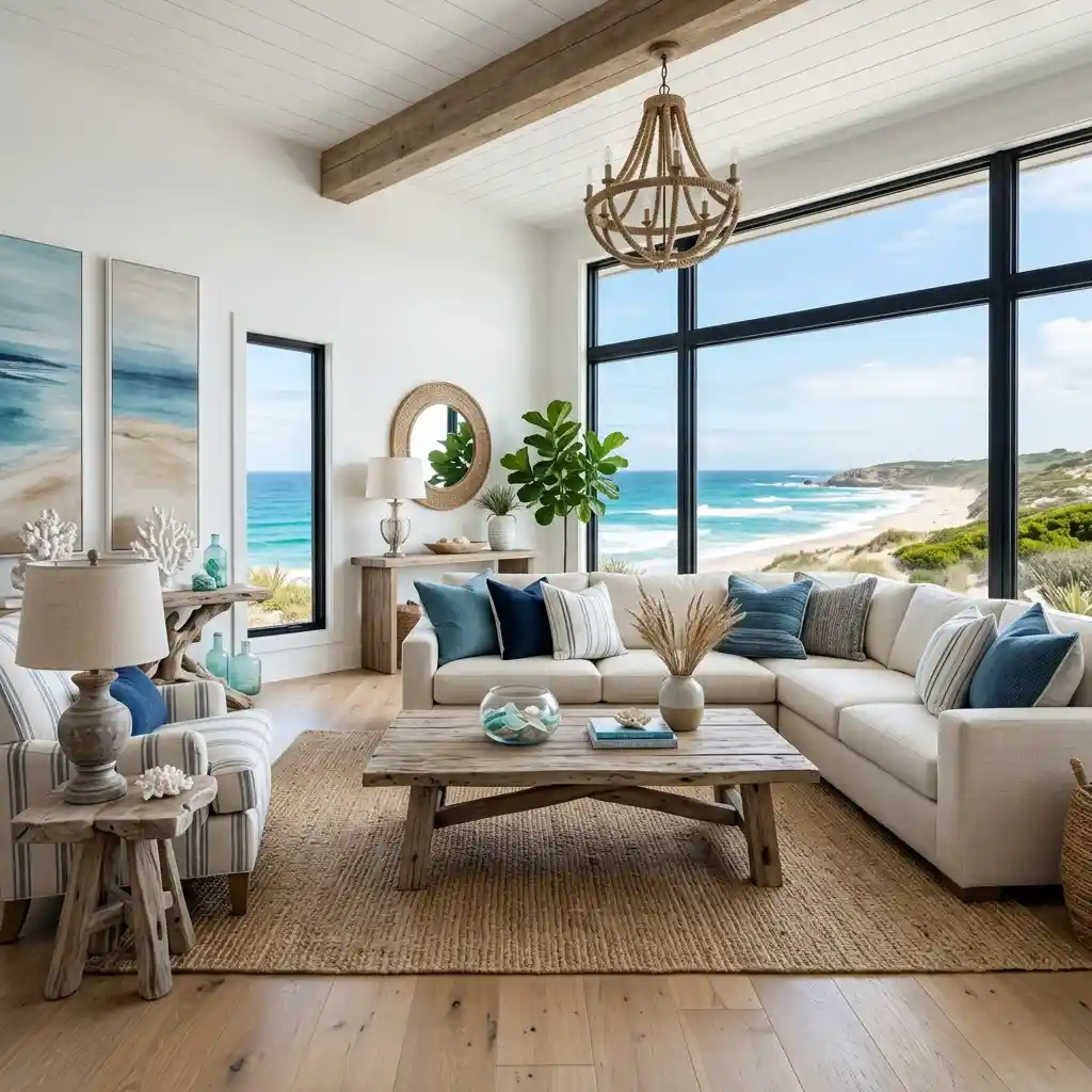
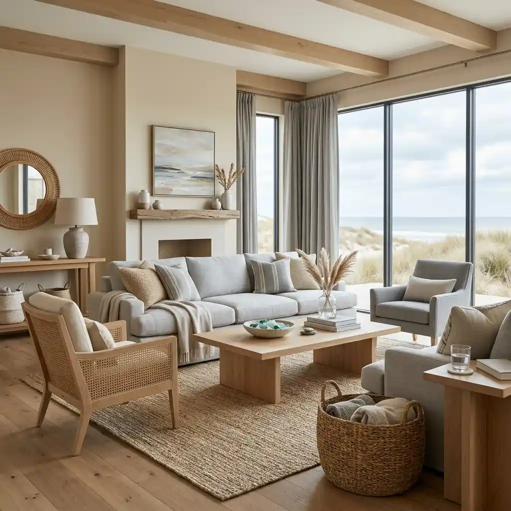
2. Coastal Blue and Ivory
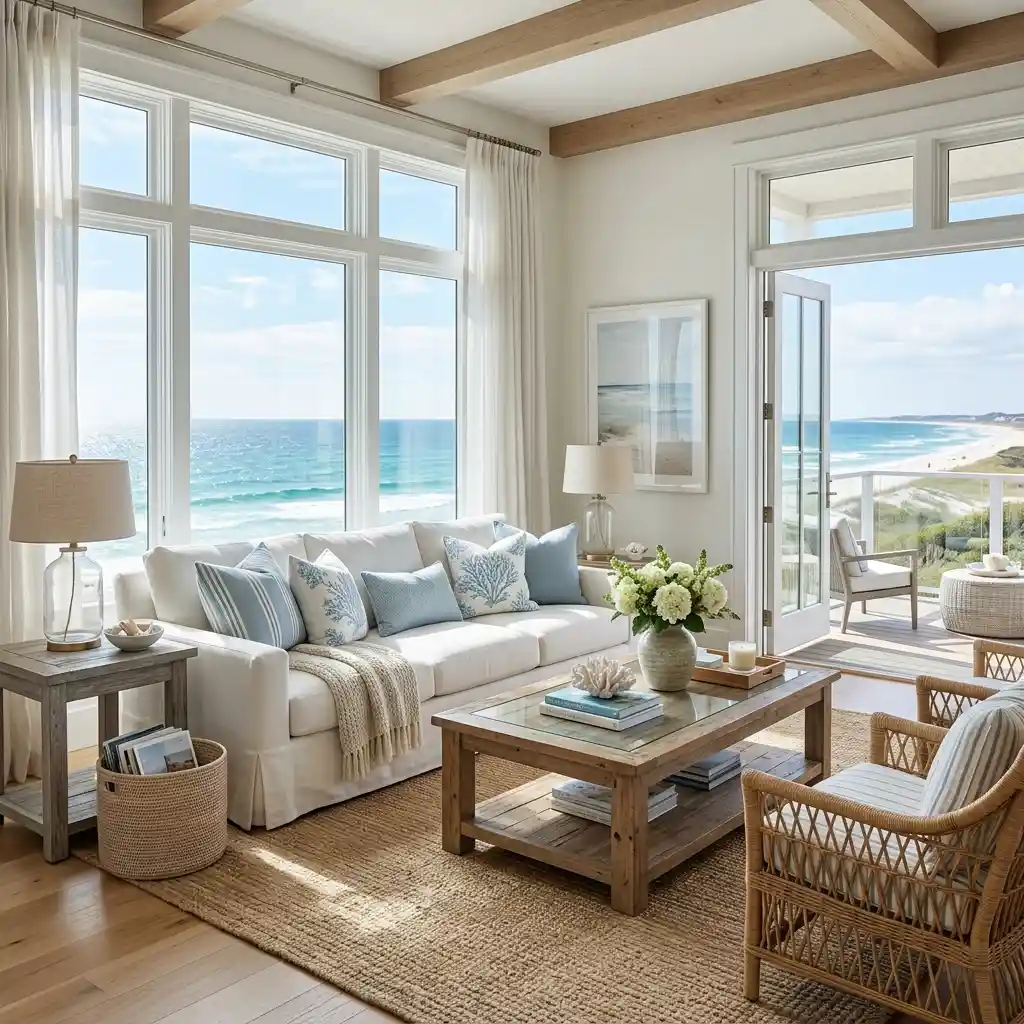
Soft coastal blue combined with ivory creates a fresh and relaxing environment. The palette captures the feeling of ocean breezes and sunny shorelines. Woven textures enhance the coastal character naturally. Light woods maintain an airy aesthetic. This creates a calm vacation-like atmosphere.
3. Sage Green and Cream
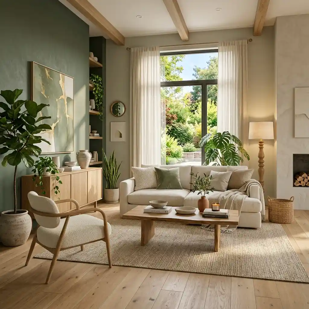
Sage green continues to dominate interior design in 2026. Paired with creamy neutrals, it introduces softness and natural beauty into any room. Organic materials complement the palette perfectly. Natural light enhances the colors beautifully. This creates a peaceful and refreshing environment.
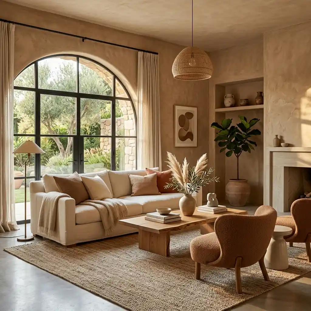
4. Terracotta and Warm Beige
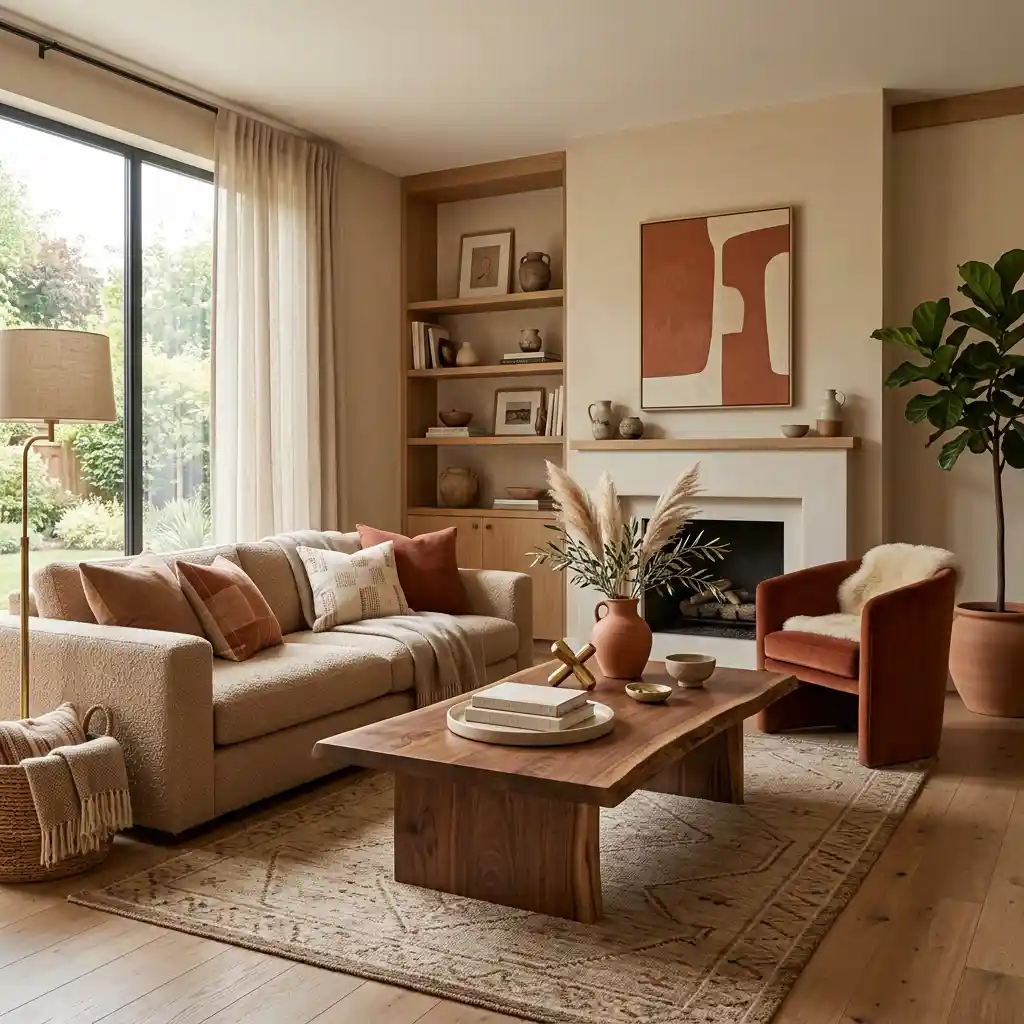
Terracotta adds earthy richness while warm beige keeps the space balanced and inviting. The combination feels grounded yet sophisticated. Textured fabrics enhance visual warmth throughout the room. Natural materials strengthen the organic appeal. This creates a welcoming summer atmosphere.
5. Butter Yellow and Soft White
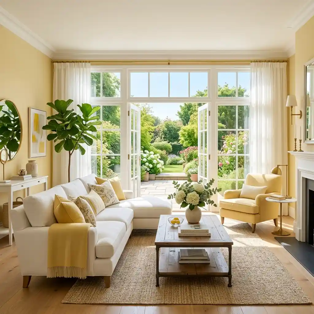
Butter yellow is one of the standout colors of 2026. Combined with soft white, it introduces cheerful energy without overwhelming the space. Natural sunlight enhances its warmth beautifully. Light wood furniture complements the palette effortlessly. This creates a bright and uplifting interior.
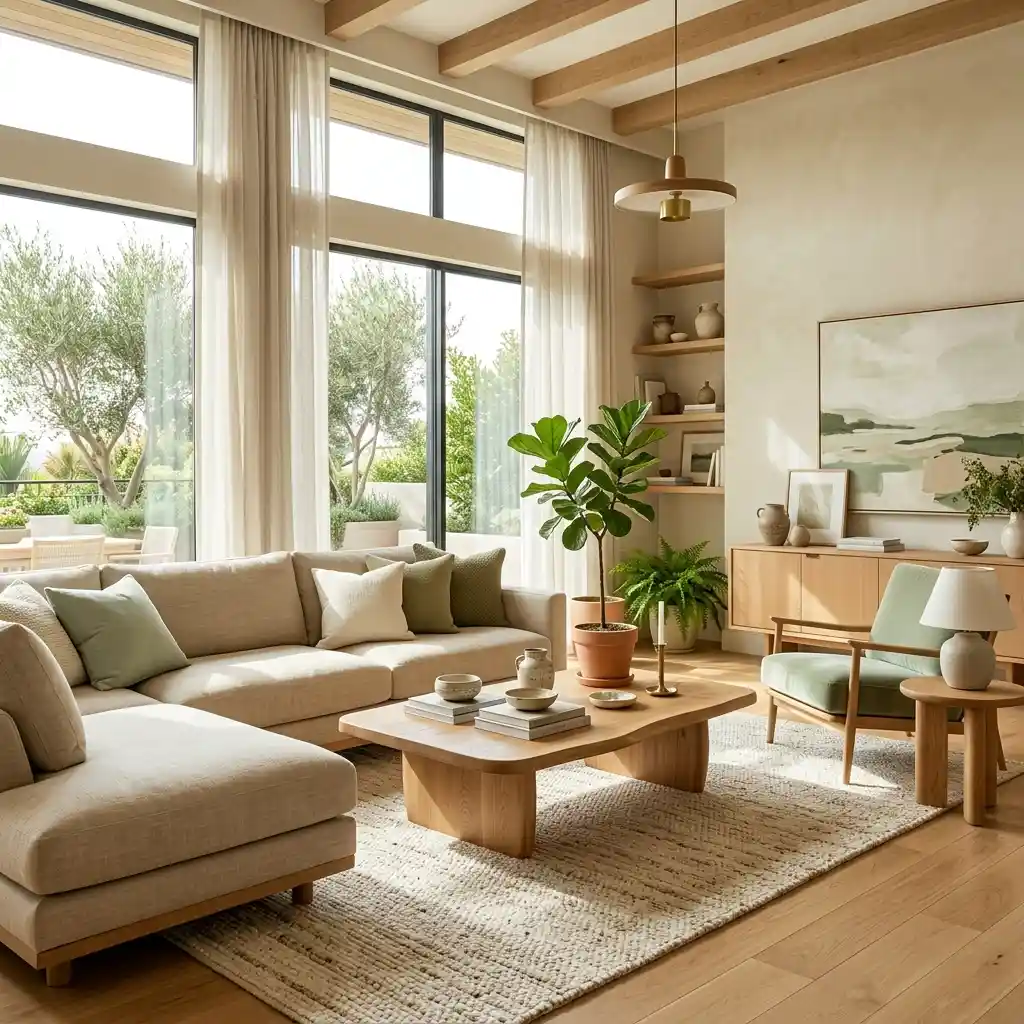
6. Olive Green and Taupe
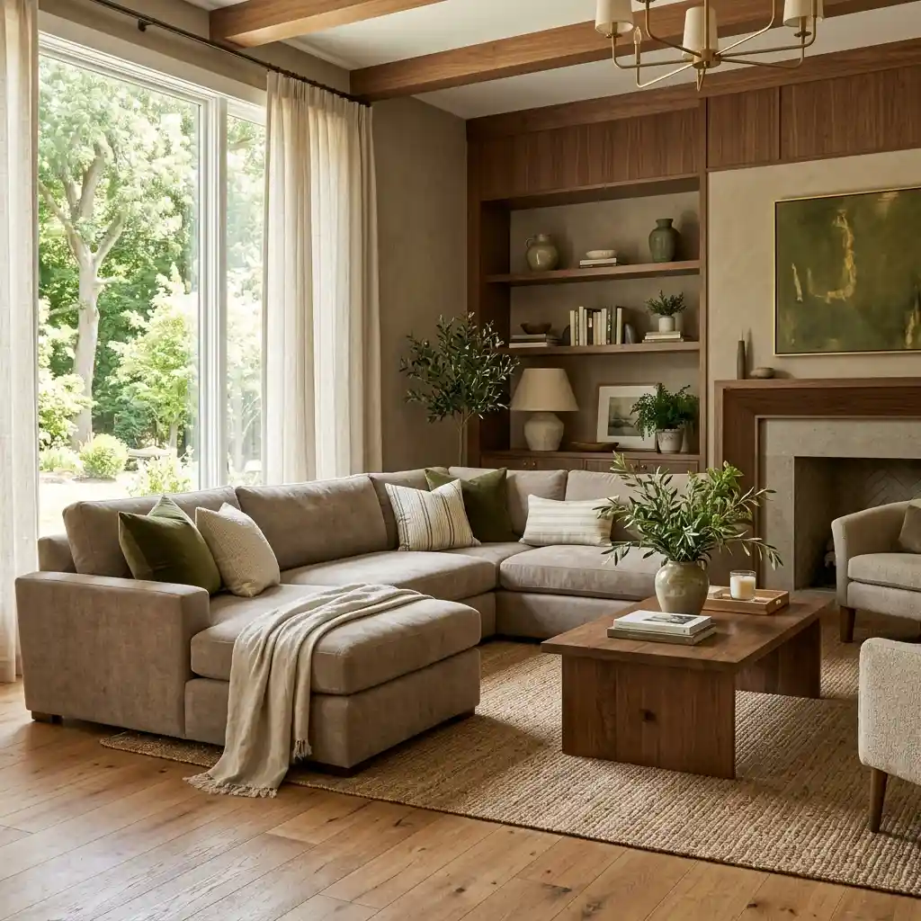
Olive green brings depth and character while taupe softens the overall look. Together they create a sophisticated nature-inspired palette. Wood accents enhance warmth throughout the room. Layered textiles improve comfort and texture naturally. This creates timeless elegance.
7. Dusty Blue and Warm Gray
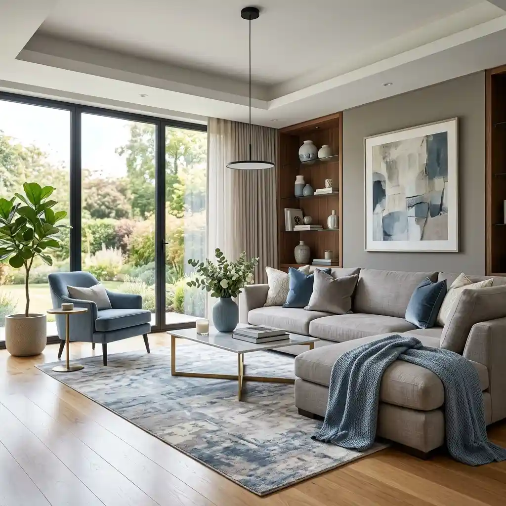
Dusty blue introduces subtle color while warm gray provides a neutral foundation. The palette feels relaxed, refined, and versatile. Soft furnishings enhance comfort beautifully. Natural lighting improves the overall softness. This creates a calm contemporary environment.
8. Clay and Ivory
Clay tones are becoming increasingly popular in modern interiors. Paired with ivory, they create warmth without feeling heavy. Organic materials complement the palette naturally. Textural details add depth throughout the space. This creates a sophisticated earthy aesthetic.
9. Soft Peach and Cream
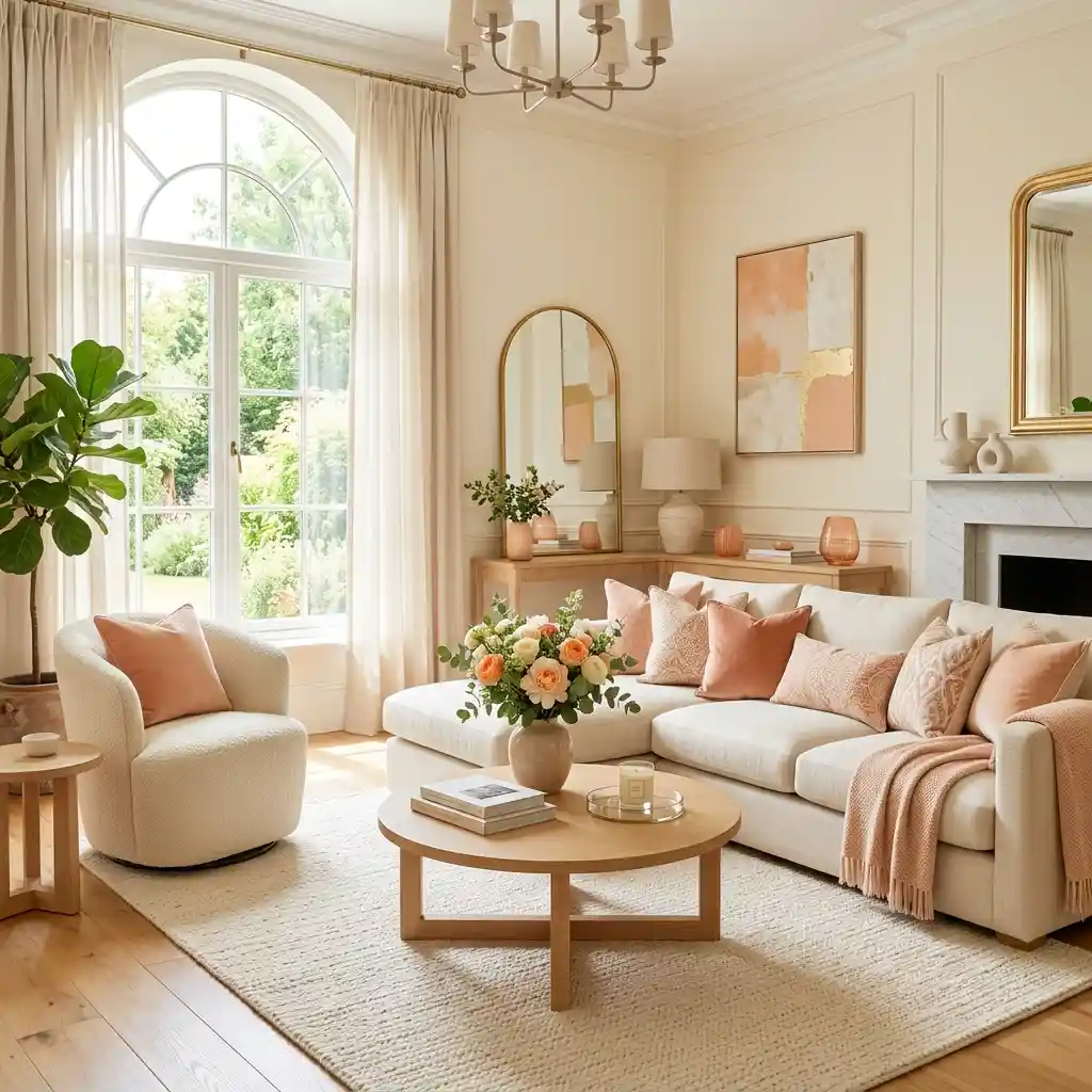
Soft peach adds a gentle warmth that feels perfectly suited for summer. Cream balances the color while maintaining brightness and elegance. Natural light enhances the subtle tones beautifully. Light woods improve cohesion throughout the room. This creates a welcoming atmosphere.
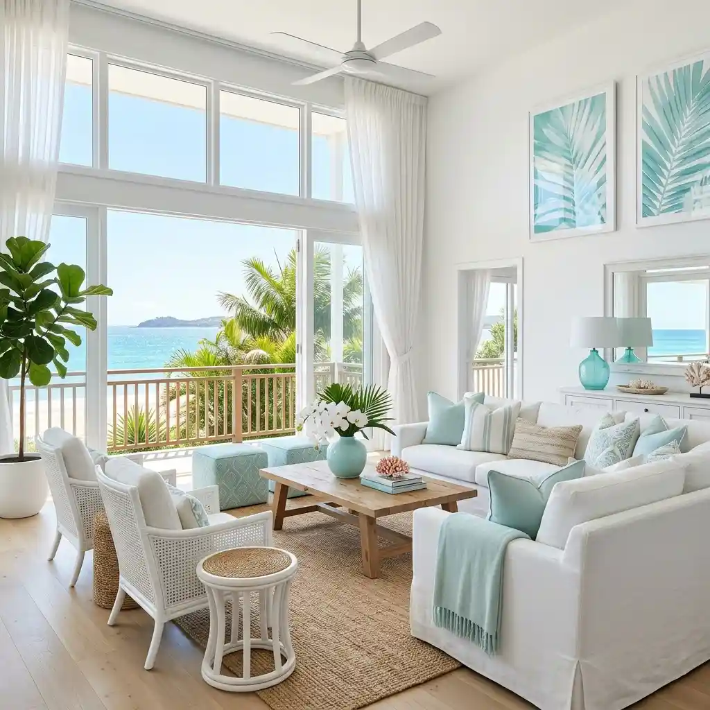
10. Seafoam Green and White
Seafoam green introduces freshness and lightness into interiors. White surfaces enhance brightness while allowing the color to shine. Coastal-inspired textures complement the palette perfectly. Sunlight amplifies the airy feeling naturally. This creates a refreshing summer retreat.
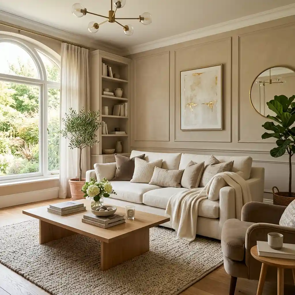
11. Camel and Warm White
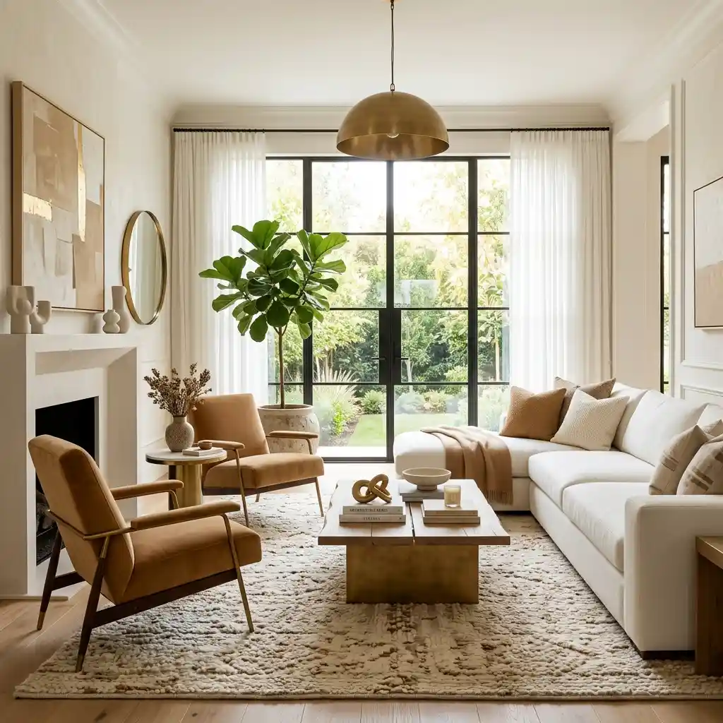
Camel adds richness and sophistication to bright interiors. Combined with warm white, it creates balance and warmth. Layered textiles improve texture and comfort beautifully. Natural materials strengthen the overall design. This creates understated luxury.
12. Sky Blue and Sand
Sky blue reflects clear summer skies while sand tones ground the palette naturally. The combination feels relaxed and uplifting. Woven materials enhance the seasonal aesthetic beautifully. Light furnishings maintain openness throughout the room. This creates effortless summer style.
13. Charcoal and Linen
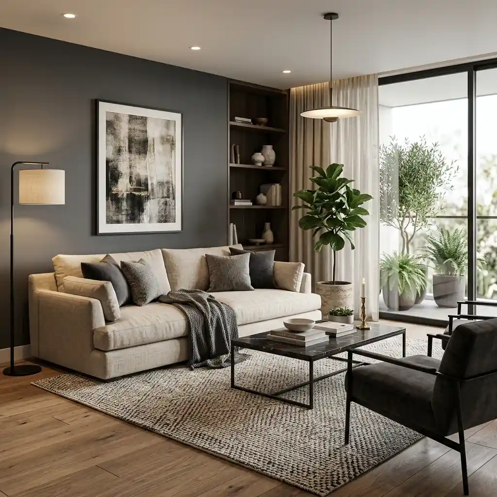
Charcoal accents add contrast while linen tones soften the overall palette. The combination feels modern yet inviting. Natural textures enhance visual warmth naturally. Layered lighting strengthens the cozy atmosphere. This creates contemporary sophistication.
14. Eucalyptus Green and Beige
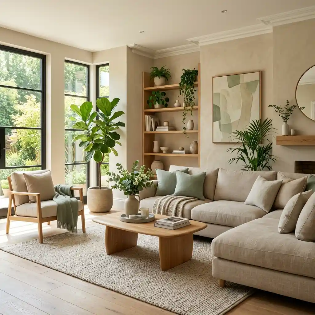
Eucalyptus green introduces a muted botanical feel that works beautifully with beige neutrals. The combination feels fresh without becoming trendy. Organic materials enhance the connection to nature. Soft lighting improves warmth throughout the room. This creates timeless appeal.
15. Coral and Soft White
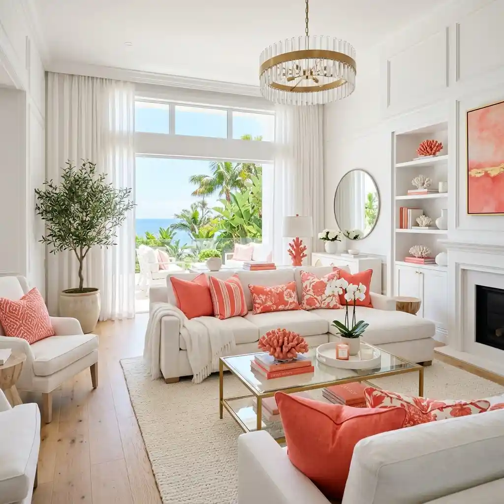
Coral introduces vibrant energy while soft white keeps the palette balanced. The color combination feels cheerful and summery. Natural textures add sophistication beautifully. Light woods help maintain visual harmony. This creates a lively yet elegant atmosphere.
16. Mushroom and Ivory
Mushroom tones continue to trend due to their versatility and warmth. Paired with ivory, they create a calming and sophisticated foundation. Natural materials complement the palette beautifully. Soft textures enhance comfort naturally. This creates timeless interior elegance.
17. Pale Green and Warm Beige
Pale green introduces subtle freshness while warm beige provides balance and warmth. The combination feels light, organic, and welcoming. Natural wood furniture complements the colors perfectly. Sunlight enhances the softness throughout the room. This creates a peaceful retreat.
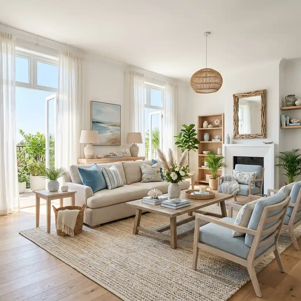
18. Ocean Blue and Driftwood
Ocean blue paired with driftwood-inspired tones creates a sophisticated coastal palette. The combination feels both energetic and calming. Textured fabrics enhance the beach-inspired aesthetic beautifully. Natural light strengthens the overall effect. This creates relaxed luxury.
19. Soft Lavender and Cream
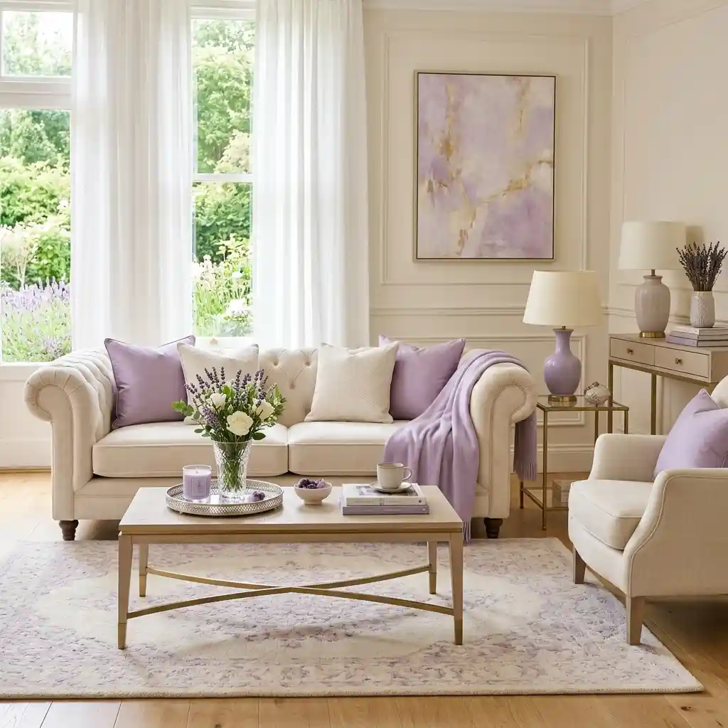
Soft lavender introduces a gentle hint of color while cream maintains warmth and brightness. The palette feels elegant and surprisingly versatile. Natural materials prevent the room from feeling overly delicate. Layered textures add depth naturally. This creates refined summer charm.
20. Warm Taupe and White Oak
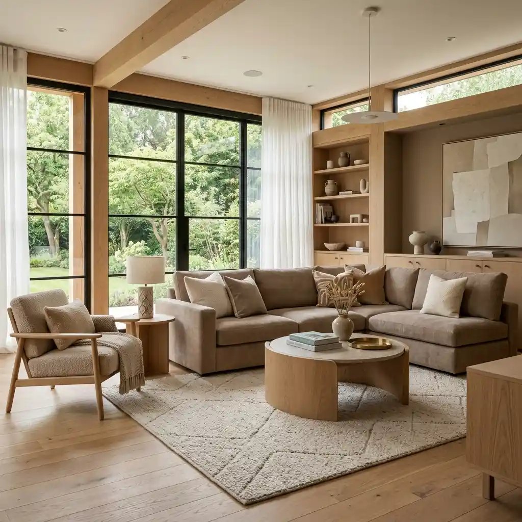
Warm taupe works beautifully alongside white oak finishes. Together they create a sophisticated neutral foundation. Soft textiles improve comfort throughout the space. Natural lighting enhances the warmth naturally. This creates a designer-inspired interior.
21. Mint Green and Ivory
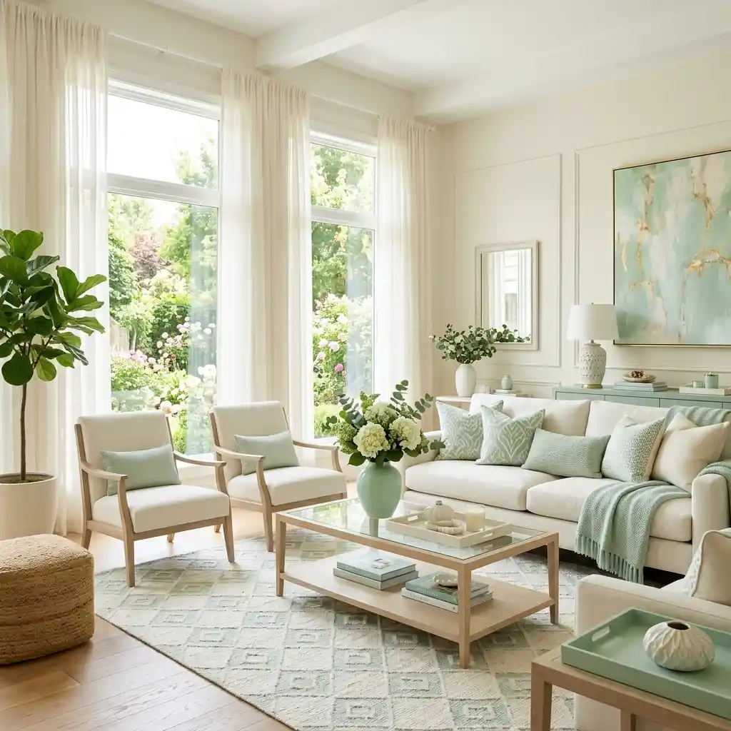
Mint green adds playful freshness without overwhelming the room. Ivory softens the palette while maintaining elegance. Natural textures balance the brighter color beautifully. Sunlight enhances the refreshing atmosphere naturally. This creates a cheerful summer environment.
22. Sandy Beige and Coastal Gray
Sandy beige introduces warmth while coastal gray adds subtle contrast. The combination feels timeless and relaxed. Woven accents strengthen the beach-inspired aesthetic. Light furniture enhances openness throughout the room. This creates effortless summer comfort.
23. Rust and Cream
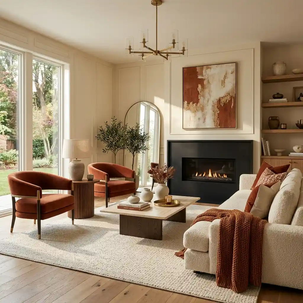
Rust tones bring richness and personality into neutral interiors. Cream prevents the palette from feeling too heavy. Organic materials enhance warmth and texture beautifully. Soft lighting strengthens the cozy atmosphere naturally. This creates inviting modern style.
24. Pale Aqua and White
Pale aqua introduces a refreshing touch inspired by tropical waters. White surfaces maximize brightness and openness throughout the space. Natural materials provide balance and warmth. Large windows enhance the palette beautifully. This creates a bright and breezy summer retreat.
25. Sun-Washed Neutrals
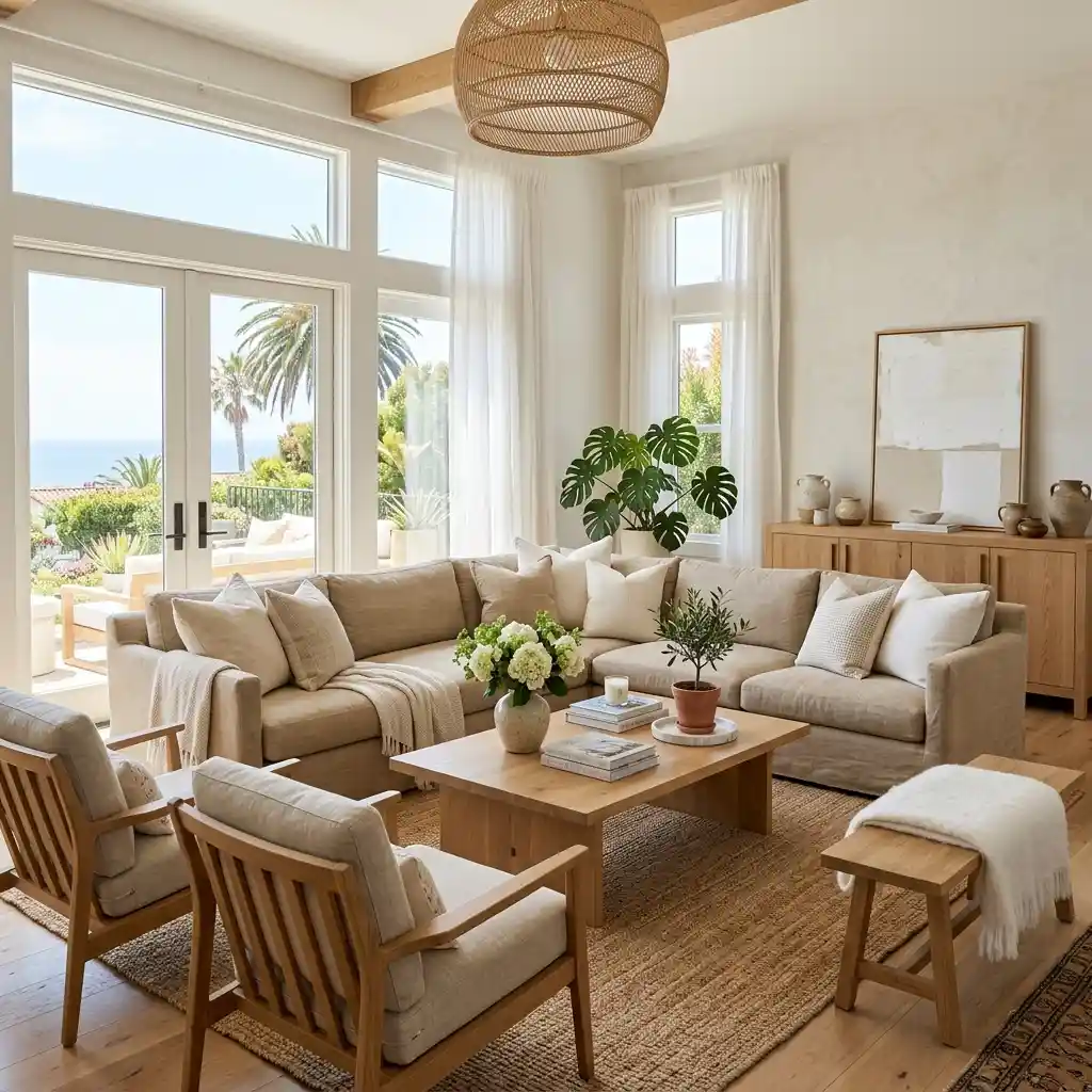
Sun-washed neutrals combine soft whites, warm beige, sandy taupe, and natural wood tones. The palette feels effortless, timeless, and perfectly suited for summer living. Layered textures add warmth without clutter. Natural light becomes a key design element. This creates a home that feels calm, bright, and inviting.
Final Thoughts:Summer Color Palette Ideas
Summer Color Palette Ideas in 2026 are all about warmth, comfort, and connection to nature. Rather than relying on bold trends, designers are embracing colors that feel timeless, livable, and beautifully balanced. Soft greens, coastal blues, earthy terracottas, warm neutrals, and sun-kissed tones are leading the way.Whether you’re refreshing a single room or redesigning your entire home, these summer-inspired color combinations can help create interiors that feel brighter, more welcoming, and effortlessly stylish throughout the season and beyond.